Level 01 · Case study
Booking platform
UX Designer and front-end
A booking site, a back office and a review app for a company that sells diving and water activities at hotels.
Context
A travel operator sells diving, snorkeling and water activities at hotels in several countries, and most of its revenue comes from sales made in person. The project set out to grow online sales by turning the website into a real e-commerce experience, so guests can explore and book before they reach the destination.
- Confidential
- The company name, brand and data are changed here. The process and the decisions are real.
Problem
The company wanted guests to book online, and the old site was not built for that. As the design took shape, two more problems appeared: the catalog needed a platform to maintain it, and there were too many products to check by hand.
- Brand
- Marketing also wanted a more modern identity that builds trust with first-time buyers.
My role
I led the UX research and the UI design, then moved into code. I worked with stakeholders, marketing, a copywriter, IT and a front-end team, and I turned components and full pages into code on their sprint board.
- Team
- We worked in agile sprints with tickets, and I also reviewed and fixed visual code written by other developers.
Process
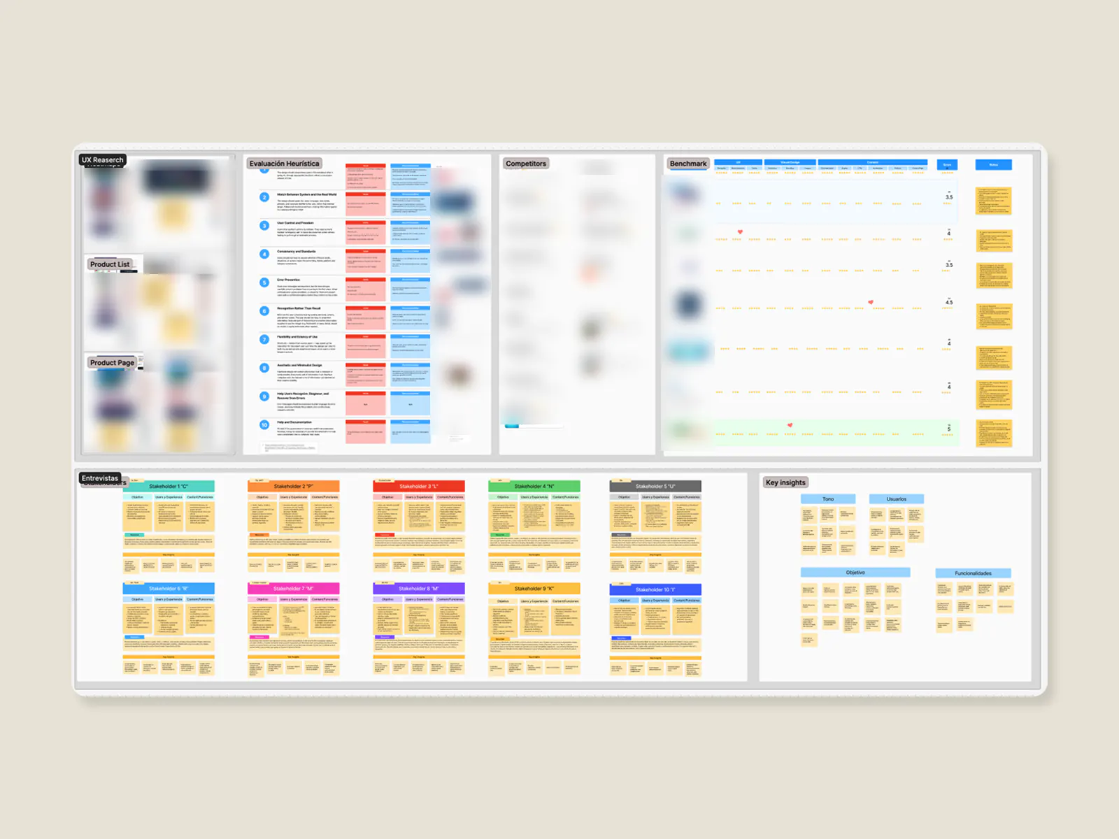
Research first: 10 interviews, a heuristic review and a benchmark of large travel marketplaces. Then a Figma library of 150+ components on Tailwind tokens and a coded demo stakeholders could click through. Along the way I proposed the back office and the review app, since the catalog could not be maintained without them.
- A decision
- I proposed building the demo in code with AI instead of a demo in Figma or Framer, so the work could be reused in the real site.
Solution
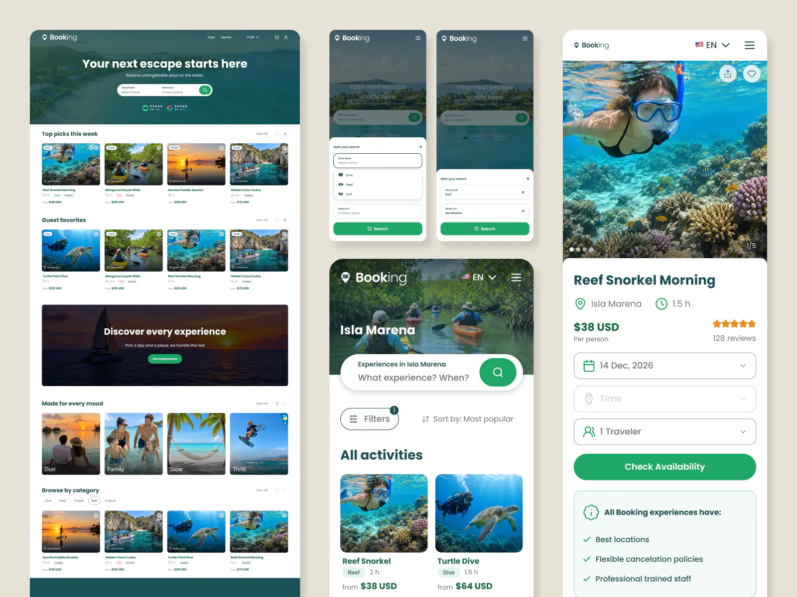
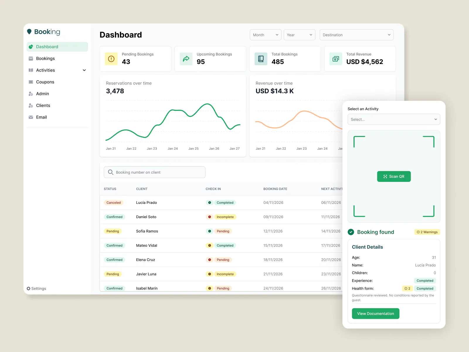
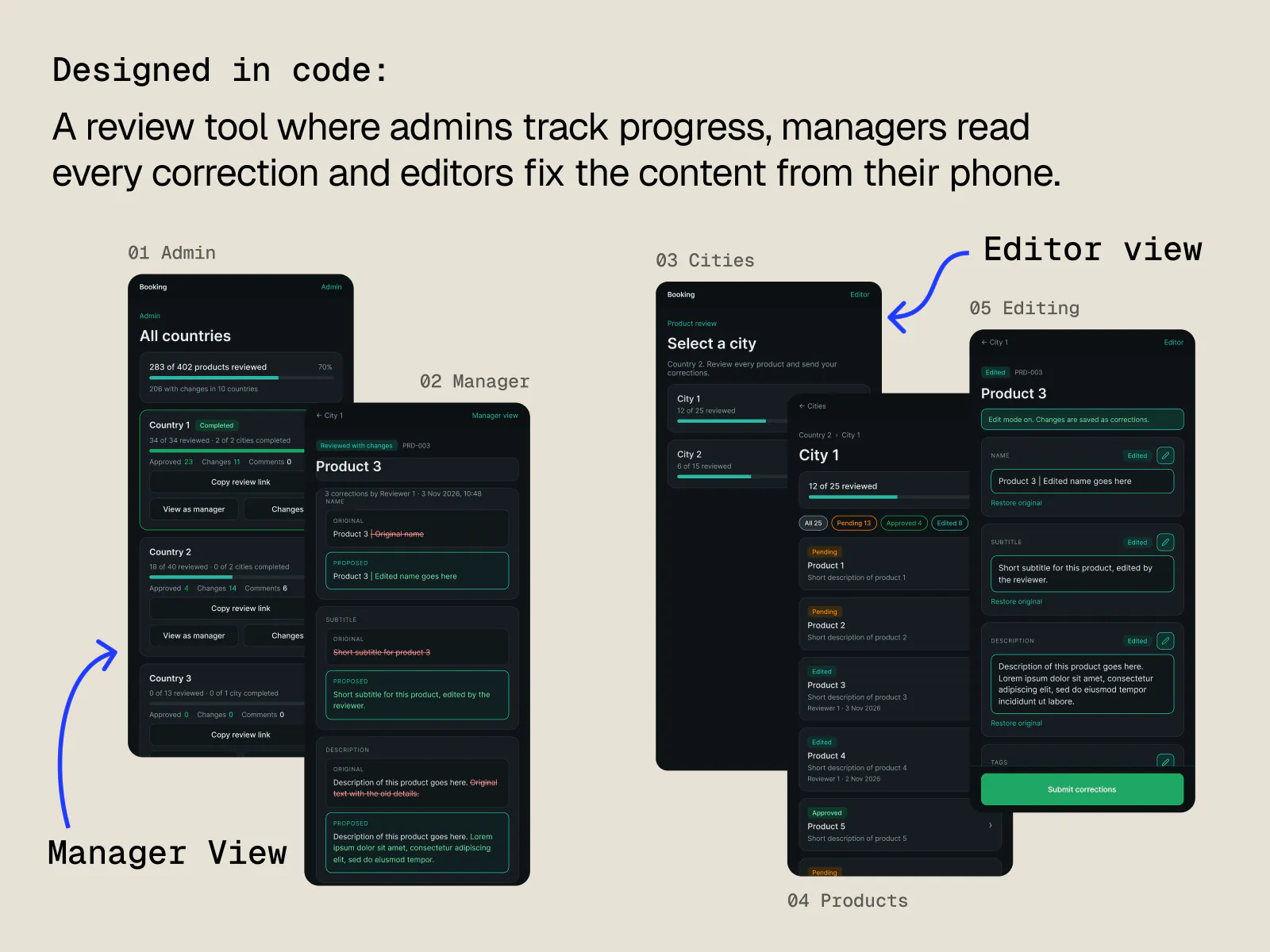
Three pieces came out of the project. A responsive booking site with a two-step search, product pages, cart, checkout and an account area. A back office to manage products, bookings and coupons. A small review app where each country manager checks and corrects product texts for the first batch through a personal link, with no login.
- Review app
- Each manager approves or corrects products field by field with a live diff, and an admin follows progress by country.
Results
The site and back office are still in development, so there are no sales numbers yet. The coded demo was well received by stakeholders, and their comments were about scope, such as which filters to offer, not about the design. The review app worked flawlessly: the people assigned to it used it without any questions.
- Results
- 10 interviews run, 150+ Figma components built and 403 products reviewed with the review app.
- Interviews run
- 10
- Figma components built
- 150+
- Products reviewed with the review app
- 403
What I learned
Good UX research and instinct get you to a strong first version, but only real use proves it works. For a small team, shipping that best guess and refining it with live data beats long design cycles spent wondering if the product works.